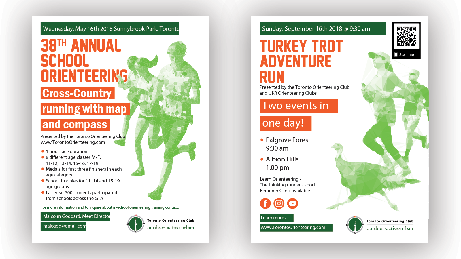
Toronto Orienteering Club flyers
While I was working for Toronto Orienteering Club’s new and unified styleguide I was asked to design their flyer that is created for various orienteering competitions that is organized by the club. The style that I came up with was to create the effect of glass or crystal for the various prizes formed from runner figures. Green and orange were the colors throughout their new brand.